


 7 / 32

October 2015 //
Canadian Government Executive /
7
Motivation
supervisor; respectively) in both Eng-
lish and French; column 6 provides the
question #, while column 7 and 8 outline
the question as stated in the PSES sur-
vey in both English and French; and the
remainder double-row columns with co-
loured rows represent the analysis per-
mutations such as branches/divisions, or
demographic grouping.
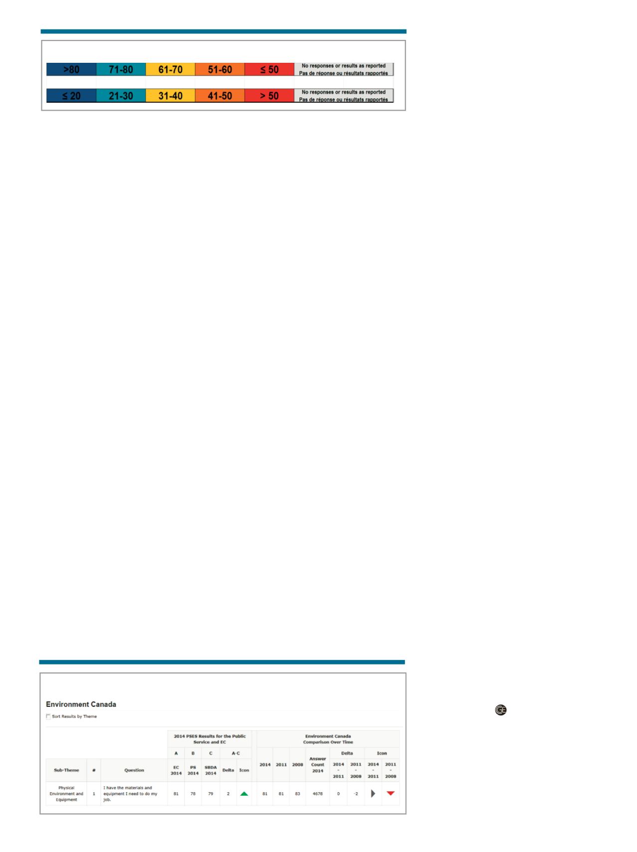
The amount of “heat” was based on a
sliding scale, representing the percent-
ages of affirmative responses (“strongly
agree” and “somewhat agree”) applied to
each survey question (Diagram 2). (The
Performance Measurement and Analy-
sis Unit in the Human Resources Branch
used a sliding scale used and recognizes
that it is open to interpretation.) Two
scales were used to address questions
worded both affirmatively and negatively.
The Performance Measurement and
Analysis Unit of the Human Resources
Branch, in collaboration with the Re-
porting and Data Warehouse team in the
Corporate Services Branch of Environ-
ment Canada, also developed an intranet
web-based internal reporting application,
using
the.NETframework and an Oracle
database, to display and analyze the PSES
2014 results on the intranet (Diagram 3).
This application provided a quick, user
friendly, web-based solution for display-
ing and analyzing the PSES results across
multiple survey years to all employees.
The web-based application gave employ-
ees immediate access to view the PSES
results using a multitude of combinations.
Diagram 3 shows one example of a
Thermal Map that was generated with
the web-based application. This example
provided a department-wide lens on one
sub-theme area. All the questions aligned
to this sub-theme would be listed in the
“question” column (in this example we
show only 1 question). The department-
wide result (81) for 2014 is shown along-
side the public service-wide result (78), the
science-based department result (79) and
the delta (A-C) as the difference between
Environment Canada and other science-
based departments (SBDA). In addition,
the next section of the diagram shows
Environment Canada’s results for the last
three PSES cycles, along with deltas com-
paring two PSES cycles.
The incorporation of simple directional
icons made the identification of changes
and trends between the different survey
results easy to interpret. This application
also allows for future survey results to be
added, thereby reducing the turn-around
time for analysis.
The web-based application allowed for
another view of the profile, but in a com-
parative perspective. In this case, users
could choose a multitude of combinations
from drop-down menus for each com-
parator. (For a full view, see this article on
www.canadiangovernmentexecutive.ca).
To develop the web-based tool, con-
cordance tables were built, question by
question, and organization unit by orga-
nization unit. Concordance tables for the
questions from the three survey cycles
2008, 2011, and 2014 were provided by Sta-
tistics Canada. The concordance tables for
organizational units were challenging to
build because of organizational changes
between the various survey years. For
example, Environment Canada’s Finance
Branch saw multiple units move in and
out over the span of the three surveys.
Diagram 2: Sliding Scale
Diagram 3: Organizational Unit Results
7 EmployeeEngagement
Mobilisationdes
employés
E_Q60 Question 60. Iwould prefer to remain with my department or agency, even
if a comparable job was available elsewhere in the federal public service.
Question 60. Je préférerais continuer à travailler au sein demon ministère ou
organismemême si un poste comparable était disponibleailleurs dans la fonction
publique fédérale.
57 59 60 60 57 58 60 60 62 61 57 56
60 57
The benefit of using the thermal maps
was the ease in which the results were
communicated to employees during the
consultations. This, in turn, provided en-
riched feedback on the PSES related is-
sues and guided the department to devel-
oping a targeted action plan for change.
A number of lessons were learned dur-
ing this initiative. In the past, numerous
tables and graphs were used to display
the survey results by individual organiza-
tions. The thermal maps brought all of the
results for every organization together in
one place. The application of colours to
a rating scale provided a global picture
along different organizational and de-
mographic dimensions, therefore allow-
ing for easy identification of horizontal
issues while leaving room for individual
organizations to identify the specific is-
sues confronting them. Also, in order to
ensure the confidentiality of respondents,
smaller organizations were combined into
larger units. In the future, these combina-
tions of smaller units should be consistent
with previous surveys in order to allow for
trend analysis.
The great advantage of using thermal
maps were that they resonated easily with
science-based professionals. The maps
were also conceptually familiar to most
members of the senior management team
and as such allowed them to immediately
focus on the areas that required their at-
tention. The map and web-based tool
became easy references as they allowed
business units and employees to view the
data in a number of different ways.
Future possibilities for these instru-
ments may focus on combining them to
automate the production of the thermal
maps and to allow for individual user cus-
tomization. These tools could be used to
assess the impact of actions undertaken to
address workforce and workplace issues
and may also serve to strengthen employ-
ee engagement as they convey the results
of management actions in response to em-
ployee feedback.
J
ohn
K
ung
is the Manager of the Per-
formance Measurement and Analysis
Unit in the HR Business Transfor-
mation Directorate of the Human
Resources Branch at Environment
Canada;
B
etty
A
nn
M. T
urpin
,
Ph.D., is
a Senior Analyst in the Unit.